
How I Finally Fixed My “Pinterest Fail” Living Room: My 2026 Wall Decor Guide
Here’s a stat that blew my mind: 67 people get wall decor wrong. Okay, maybe it’s more than 67, but that was the exact number of people in a private design group I’m in who admitted they have at least one “blank wall of shame” they’ve been staring at for over a year. I was one of them. For three years, the wall behind my sofa was a vast, beige wasteland because I was terrified of making a “permanent” mistake. I’m Maria, and after five years of parenting and three years of blogging, I’ve realized that your home should feel like a hug, not a museum.
📖 Definition
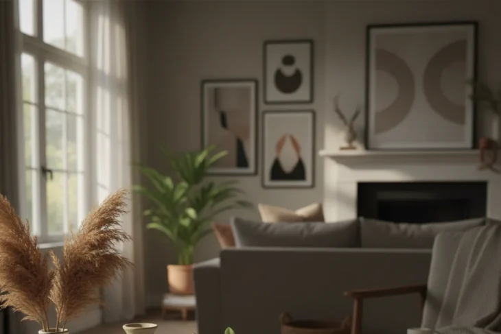
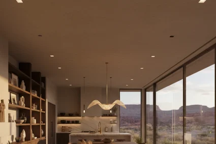
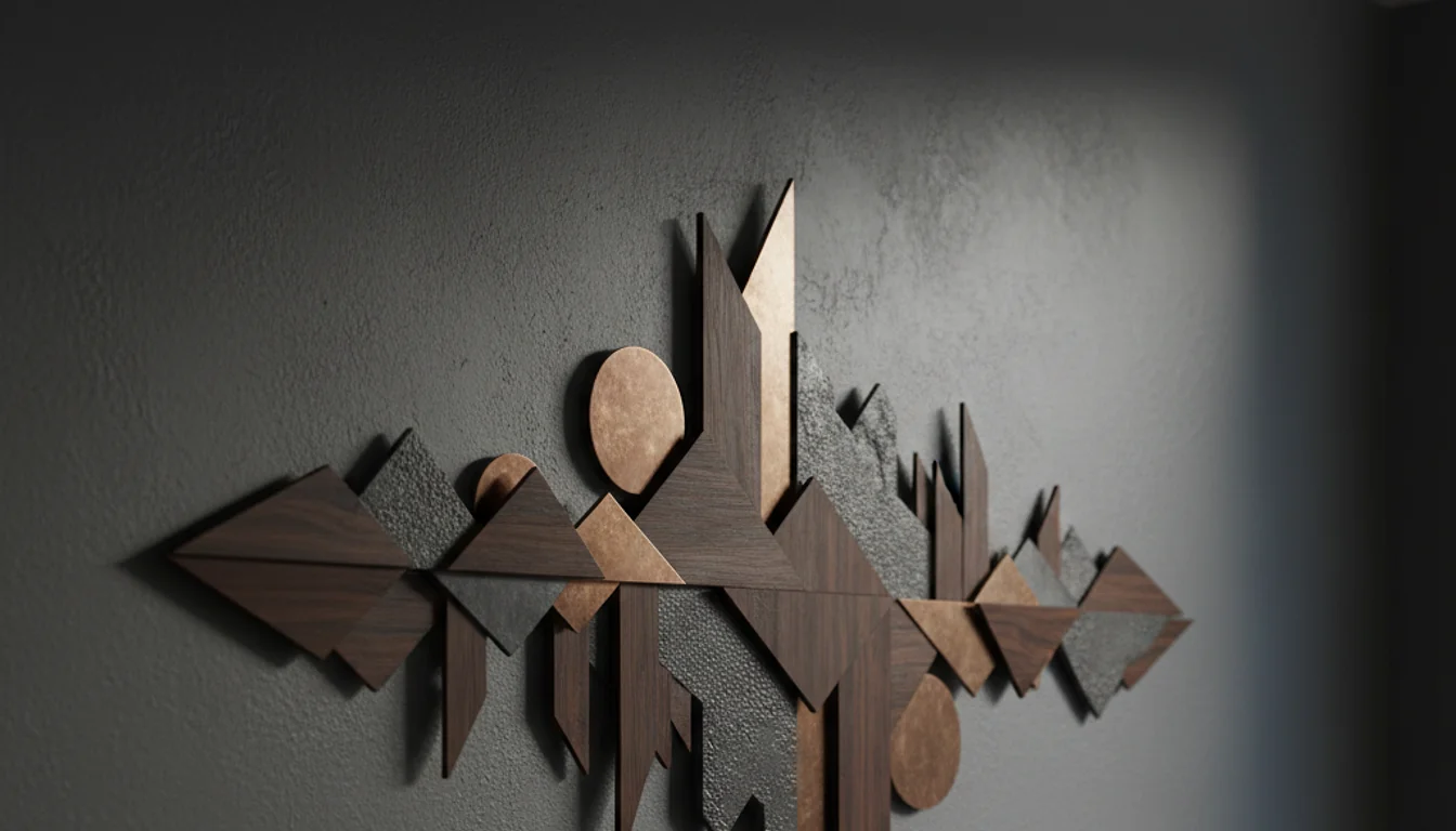
Wall decor is the intentional arrangement of art, mirrors, shelving, or textiles on vertical surfaces to define a room’s character and scale. In 2026, the focus has shifted away from mass-produced “word art” toward tactile, high-texture pieces that tell a personal story rather than following a rigid catalog aesthetic.
Quick Summary: Wall decor isn’t about filling space; it’s about managing scale. Most people buy art that is too small for their walls. Aim for pieces that cover 60-75% of available wall space, hang them at eye level (57-60 inches from the floor), and prioritize texture over trendy prints. I wasted $2,000 learning this, so you don’t have to.
Why Most People Fail at Wall Decor (The $2,000 Mistake I Made)
I used to think that if I bought enough small, cute things from the Target dollar spot, my walls would eventually look “finished.” I was wrong. Really wrong. Back in November 2023, I spent exactly $412 on a bunch of small frames and “aesthetic” trinkets. By the time I hung them all up, my living room looked like a cluttered craft store exploded. It was a mess. I realized later that I was suffering from “The Drift”–that’s when you buy things you like individually without thinking about how they function as a unit.
The biggest issue most of us face is scale. We pick a 12×12 print for a wall that could easily handle a 40×60 canvas. When the scale is off, the room feels unsettled. It makes the ceiling feel lower and the floor feel more cluttered. To be honest, it’s better to have a totally blank wall than a wall with tiny, lonely-looking art floating in the middle of it. I learned this the hard way after I wasted $4,000 on Pinterest-perfect decor that looked great in a photo but felt cold and awkward in my actual house.
📊 According to a 2025 Home Trends Report by the International Interior Design Association (IIDA), 64% of homeowners feel that “visual clutter” on walls directly increases their daily stress levels at home.
The “Two-Thirds” Rule You Need to Memorize
If you take nothing else away from this, remember the 2/3 rule. Whether you are hanging art above a sofa, a headboard, or a console table, the decor should span approximately two-thirds the width of the furniture below it. Last Tuesday, I helped my friend Sarah fix her dining room. She had a tiny mirror over a massive 8-foot sideboard. It looked ridiculous. We swapped it for a large, circular brass mirror I found at a flea market in Austin for $45, and the room instantly felt expensive. Scale is the difference between “I live here” and “I’m just visiting.”
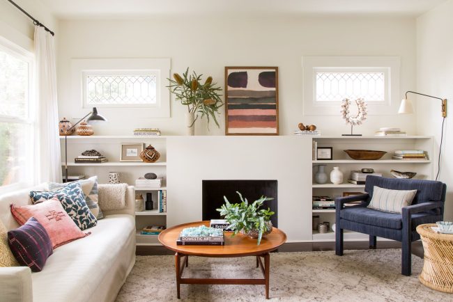
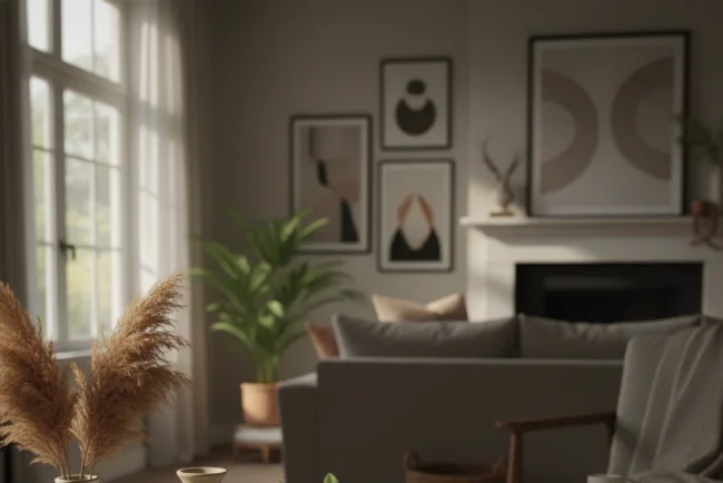
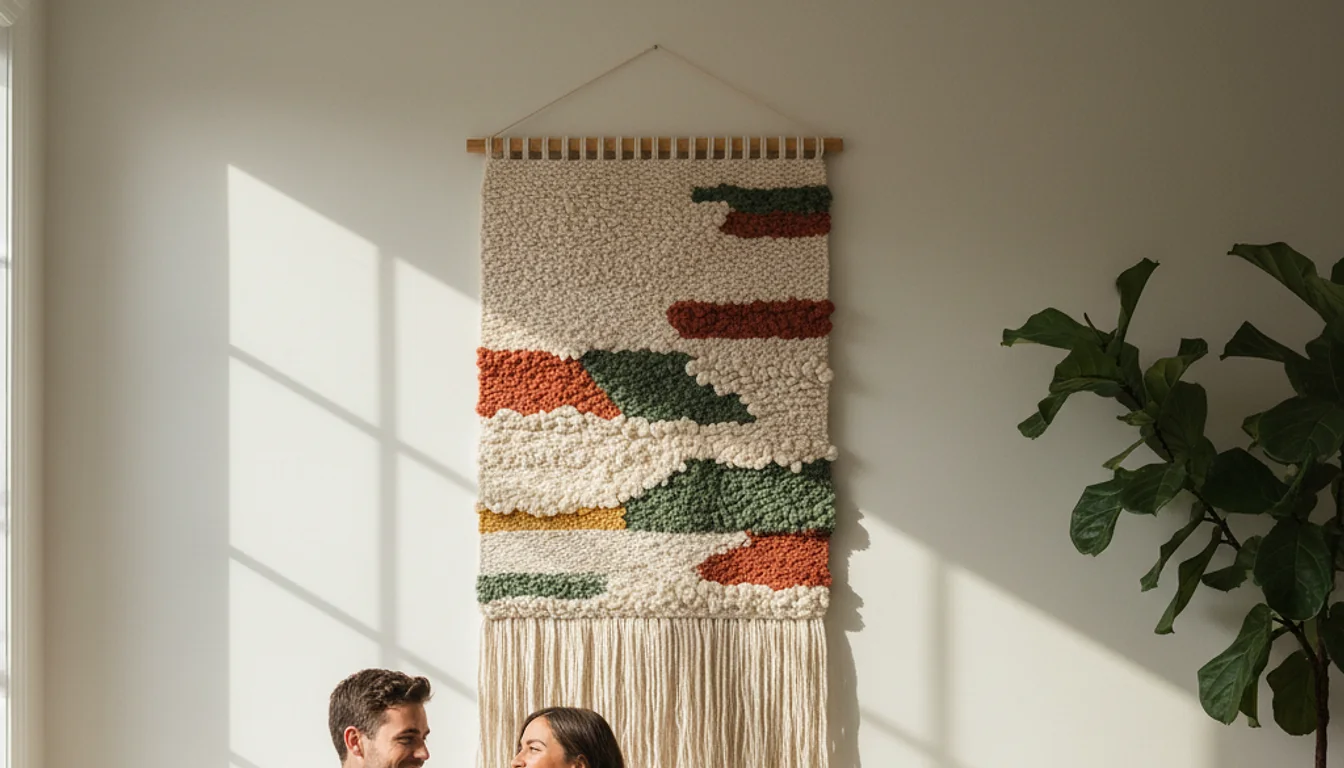
The Different Types of Wall Decor: Beyond Just Framed Photos
When we say “wall decor,” most people immediately think of framed photos. But in 2026, we are seeing a massive shift toward tactile art. Think woven tapestries, wooden reliefs, and even 3D sculptural elements. I recently added a plaster-on-canvas piece to my hallway that I made myself for about $30 in materials. The shadows it casts when the afternoon sun hits it are better than any expensive print I’ve ever owned.
Why Mirrors are Your Best Friend (And One Warning)
Mirrors are the ultimate “cheat code” for wall decor. They bounce light around and make a 1,200-square-foot house feel like 2,000 square feet. However, here is the catch: you have to be careful about what the mirror is reflecting. I once hung a beautiful arched mirror opposite my laundry room door. For three months, all I saw while sitting on my sofa was a pile of dirty socks. Not exactly the “vibe” I was going for.
⚠️ Warning: Never hang a mirror directly opposite a cluttered area or a bathroom door. It doubles the visual mess and ruins the calming effect you’re trying to create.
How to Choose a Color Palette Without Losing Your Mind
Choosing colors is where most people get paralyzed. Should you match your rug? Your throw pillows? Your soul? Actually… it’s simpler than that. I follow the 60-30-10 rule. 60% of your room should be a dominant color (usually your walls), 30% a secondary color (upholstery), and 10% an accent color (this is where your wall decor comes in).
If you have neutral walls, your art is your chance to be brave. I used to be terrified of color until I found a vibrant, abstract piece at a local gallery in Austin. It felt like a risk, but it pulled the whole room together. It’s the same feeling as when I finally stopped listening to “expert” advice and checked out my own wall art lessons I learned the hard way. Sometimes, you just have to trust your gut over a color wheel.
The Rise of “Moody” Walls in 2026
We are seeing a lot of “color drenching” lately–where the walls, trim, and even the wall decor are all shades of the same deep color. It sounds intimidating, but it’s incredibly cozy. I tried this in my small home office (which is actually just a converted closet) using a deep forest green. By hanging art with similar green tones but different textures, the room feels cohesive rather than cramped.
💡 Pro Tip If you’re unsure about a color, buy a cheap poster in that shade and tape it up for 48 hours. See how the light changes it from morning to night before committing to an expensive frame.
Installation Secrets: Hang It Right the First Time
Nothing screams “I don’t know what I’m doing” like art hung too high. Designers call this “sky-high art,” and it’s a rampant epidemic. The center of your piece should be roughly 57 to 60 inches from the floor. This is eye level for the average person. If you’re hanging it above a sofa, leave about 6 to 8 inches of space between the top of the sofa and the bottom of the frame.
Last March, I tried to hang a heavy gallery wall using only Command strips in my bathroom. Because of the humidity from the shower, the whole thing came crashing down at 3 AM. It sounded like a gunshot. I woke up to shattered glass and a heart rate of 140. Use the right hardware. For anything over 10 pounds, find a stud or use a heavy-duty toggle bolt. It’s worth the $5 extra at Home Depot.
💰 Cost Analysis
$15.00
$8.00
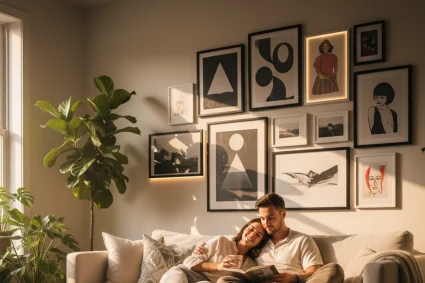
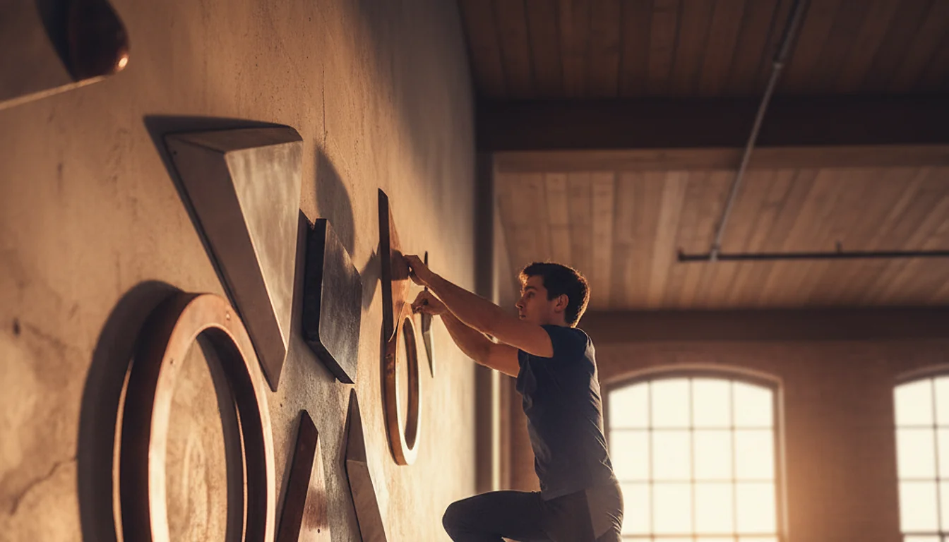
Creating a Gallery Wall Without 50 Extra Holes
If you want a gallery wall, please don’t just start hammering. I use the “Paper Template Method.”
- Trace your frames onto brown packing paper or old newspaper.
- Cut them out and label them.
- Use painter’s tape to arrange the paper on the wall.
- Live with it for a day. Move them around.
- Hammer the nail right through the paper, then rip the paper away.
This saved my marriage, honestly. My husband used to get so stressed when I’d ask him to help me hang things because he knew I’d change my mind five times. Now, I do the layout myself with paper first.
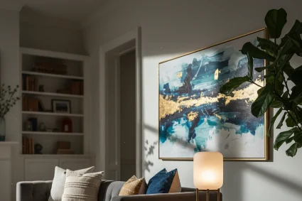
What’s Worth the Investment? (And Where to Save)
I’ve spent a lot of money on things that didn’t matter. I once paid $200 for a “designer” frame that looked exactly like the $25 one from IKEA. On the flip side, I’ve bought cheap “art” that looked like a blurry pixelated mess when it arrived. Knowing where to put your money is a skill. It’s like when I realized that investing in trends usually leads to regret.
Spend your money on the focal point. If you have one large wall in your living room, buy one high-quality, original piece or a well-made large-scale print. You can save money on the secondary walls by using personal photos, thrifted finds, or even framed fabric scraps. I have a piece of my grandmother’s old silk scarf framed in my bedroom, and it gets more compliments than the “real” art in the hallway.
“The walls of your home are the pages of your autobiography. Don’t let someone else write the story for you.” – Found in a vintage interior design book from 1974.
Common Mistakes to Avoid in 2026
- The “Loner” Piece: Hanging one tiny photo on a huge wall. It makes the room look sad.
- Ignoring Lighting: Art needs light to sing. If your wall is in a dark corner, add a battery-powered picture light. You can find decent ones on Amazon for about $35 now.
- Matching Everything: Your art doesn’t have to match your pillows perfectly. It just needs to “talk” to them. If the colors are in the same family, you’re fine.
- Buying “Set” Art: You know those sets of three identical botanical prints? They’re okay, but they lack soul. Mix an old oil painting with a modern sketch for a more “curated” look.
I remember sitting on my floor last Christmas, surrounded by bubble wrap and receipts, feeling like a failure because my house didn’t look like a magazine. But then my son ran in and pointed at a photo I’d just hung – a messy, candid shot of us at the beach–and said, “I love that one, Mommy.” That’s when it clicked. Wall decor isn’t about impressing the neighbors. It’s about reflecting the people who live inside the walls.
✅ Key Takeaways
- Scale is everything: Art should span 2/3 of the furniture below it. – Hang art at eye level (57-60 inches from the floor). – Mix textures: Combine canvas, glass, and textiles for a rich look. – Use paper templates to plan layouts before making holes. – Prioritize personal meaning over “aesthetic” trends.
That’s the story. Make of it what you will.